Annoying banners: A plea for quality
Banners play an essential role in many site’s business models so they are an inevitable price paid for all the free content that is available on the internet. To get a user’s attention a lot of practices are employed like animation, placement or sound (horrible). Today I stumbled on a T-mobile advert on the site nu.nl that indeed attracts a lot of attention but does so in a questionable way: It makes using the visited site almost impossible. (Not a new phenomenon and it’s certainly not the first time I encounter such a banner).
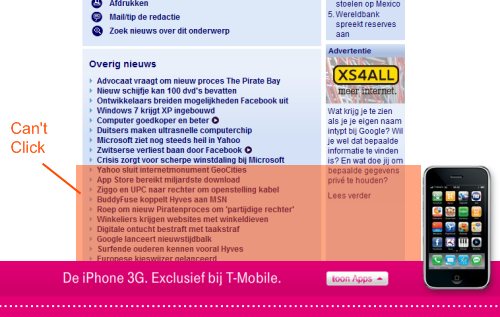
The T-mobile banner is positioned at the bottom of the viewport and is kept in place by javascript or actionscript. This means that during scrolling the banner shakes because the script reacts to the scroll event. No awards won but not a real problem either. But what is bad is the fact that in the orange area (note the little pun there) no link can be clicked. Something I didn’t notice at first resulting in rapid agitated clicking. See screenshot below:

T-Mobile banner on nu.nl
As a ‘normal’ visitor that is just annoying but as a web-professional it irritates me to a great extend that there seems to be no technical need for this misbehaviour whatsoever. So what goes wrong? On a first glance there seem to be four roles involved:
- Nu.nl: They need adds but it seems unlikely they want banners to block parts of their site and thereby cause user frustration.
- The banner merchant. Doubleclick, adclick or whatever their names are. I’m not really into the advertisement business but I wouldn’t be surprised if different advertisement programs exist that site publishers can use: flashy or not, type of products promoted, sound or not, full page mayhem or not. That sort of differentiations. Normally adds on nu.nl aren’t this annoying so something might have gone wrong there.
- The developer or company developing the banner. Perhaps there’s a tight deadline. Perhaps technical knowledge is lacking. Maybe they just don’t care…
- The advertiser, in this case T-Mobile. Bottom line is: they want to get visitors to their site. But perhaps reputation might be a consideration. I think in most cases that the people reviewing a banner proposol don’t have the knowledge to determine that a banner has these unwanted technical side-effects. Or the prototype presented doesn’t show the problems.
So somewhere in the process things go wrong, be it a lack of knowledge or a lack of interest for the end-user. Sadly the result is a lack of quality having bad usability as a consequence.
To conclude this criticism in a more positive and constructive fashion I’ve made a quick css proof of concept showing that it’s perfectly possible to achieve the layout while preserving click access to the underlying site.
Bottom aligned banner proof of concept
It’s positioning is now done by using css position:absolute but could just as well have been javascript. The demo took about 15 minutes to make while watching tv. I haven’t tested it on IE6 so expect about 2 hours needed for that but even then development time seems reasonable. The advertisment html part is displayed below.
<div id="banner" style="background-color:purple;position:fixed;bottom:0;width:100%;height:80px;">
<div id="bannerCenter" style="width:760px;height:80px;position:relative;margin:0 auto;background-color:red;">
<div id="phone" style="position:absolute;width:100px;height:160px;left:660px;top:-100px;background-color:#666;z-index"100;">
</div>
</div>
</div>
</body>
Of course the real world is more complicated than can be described in a short article but it’s obvious that the examined banner is sub-par. In my opinion it would be wise, or at least nice, to take the user a bit more seriously.